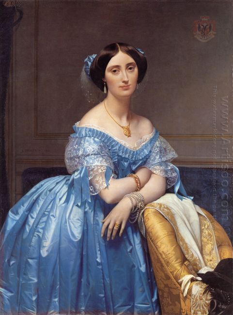
Portrait of The Princesse De Broglie

In 1853, when Jean Auguste Dominique Ingres was 73-year-old, he painted the Princesse de Broglie according to the princesse’s husband’s request. The oil painting is a representative of realism. Ingres precisely showed every detail to people. We can easily find the details from the rich satin and lace of the princesse’s gown, the silk damask upholstery, and the richly embroidered evening scarf draped across the chair. Everything looks so peaceful, beautiful, and exquisite. Apart from that, the jewelry princesse wears is an important part to show her wealth, beauty, especially her taste, such as the golden necklace, the pearl earrings, the bracelets and ring. This kind of taste most of time means her cultivation. In that time, what you wore showed what you have learned and what you have gotten. Most importantly, it told others your status. This is very significant in that hierarchical society.
Portrait of The Princesse De Broglie

What impresses deeply people on the painting maybe the princesse’s slight smile. She is standing against the golden chair, looking straight. It seems that she is thinking some sweet things which make her smile slightly. She looks so peaceful and elegant. No matter who see her will be attracted by her beauty. She tilts her head and emerges in her thought. So we start to think about what she is thinking. What kind of thins can make the beautiful princesse smile and think devotionally. This is the reason why the oil painting attracts so many people’s attention more than a century.
Portrait of Giovanni Arnolfini and His Wife

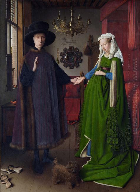
Portrait of Giovanni Arnolfini and His Wife is Jan Van Eyck’s masterpiece in portrait work. He has been completely gotten rid of the restrained tradition in the Middle Ages, and reproduced the character’s appearance and personality traits faithfully.

Portrait of Giovanni Arnolfini and His Wife

Arnolfini is a real life person who was knighted by Duke Philip in 1420. Jan Van Eyck portrayed the image of a typical bourgeois, Arnolfinis’ appearance and personality. Besides, he also described the interior decoration which showed his talents in painting. In the painting, not only the gesture of Arnolfini and his wife but the space environment and props have significant meanings. Their gesture means loyalty, the husband would support his wife and the wife would be true to her husband forever. In the painting, chandelier hang on the ceiling lighted a candle, which means the way to heaven, the white headscarves means chastity and virginity. The colors also carry meanings, green stands for fertility and the red color in the bed stands for harmony. All of these symbols have religious faith in Christianity and the idea of secular, which Jan Van Eyck painted them particularity in the picture. In the middle of the figure, a mirror hangs on the wall, whose frame is circle by 10 prominent flower-shaped squares, and the square with a small circle that painted a religious story about Jesus in it. More surprising, the middle of this mirror can reflected the entire room.

Portrait of Giovanni Arnolfini and His Wife is a subtle and delicate painting which is a peculiar wonder in the world, and we can only see this kind of painting in Netherlands’s miniature. As we described, using a mirror reflection to expand the screen space is another distinctive feature of this masterpiece, all of which has a great influence and inspiration on the Dutch genre.


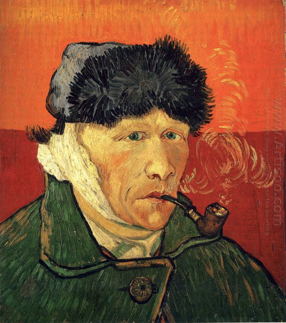
Self Portrait with Bandaged Ear by Vincent Van Gogh

Self Portrait With Bandaged Ear

Self Portrait with Bandaged Ear is one of Vincent Van Gogh’s self portraits, but there was a story in this famous painting. It is said that in the year 1888, Van Gogh invited P.Gauguin to live with him. However, the two artists are too stubborn to quarrel with each other. Later, Gauguin left with anger, while Van Gogh flew into a rage that he cut off his right ear then offered it to a prostitute as a gift.

In the painting of Self Portrait with Bandaged Ear, Van Gogh’s head wrapped in gauze, under which was bloodstained wound. The first thing that

colors and Ping Tu, which highlighted the portrait itself. In this painting, the color achieved a perfect integration in a strong contrast.

Cutting off the ears seems like a symbolic scene that summarizes Van Gogh’s life tragedy with self-injury. What the painting leaves us is a vivid description about his mental state when he lived in Arles. On the other hand, we can learn that painting is the art of silence, and you have to pay for the beauty, just like an artist would mess up his life on the way to art, but the truth is that his ears still alive.

Adam and Eve By Fernando Botero

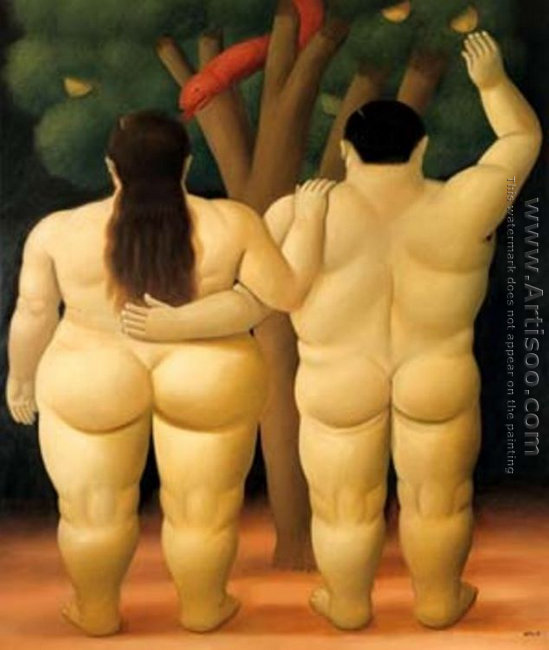
Adam and Eve which painted by Fernando Botero, was another work reflected his painting style directly and obviously. Everyone would impress by the shape of characters and elements in his paintings, all of which are strong, large and fat with exaggerated. Contrary to the pursuit of being thin in contemporary, Botero provides us a totally different aesthetic standard, that is “fat is innocent, but another sense of beauty.”

Adam and Eve
Adam and Eve

This painting sets Adam and Eve in the Bible as the theme, snake and tree of good and evil also appear. Both the man and woman who stand in front of a tree are fat and naked with their back to us, while the snake twines round the big tree, attracting Eve to eat fruits in the tree of good and evil as what the Bible described. In this painting, we can feel a strong sense of three dimensional from the line of naked body and the snake was painted red color, because in western country color red represents evil and danger, which portrayed the story vividly. We can see that Botero was so meticulous about the use of colors, never excessive abuse nor excessive render the color. That is why we are very difficult to see the projection. He always relies on improving the image contrast and reflection so as to achieve the purpose of modeling.

Botero once said, “What important for me is that every one who sees my work should recognize it is Botero’s.” For him, art is the need to express his inner world. As we see now, he achieved it.


Rape of Europa

Rape Of Europa
Rape Of Europa

Rape of

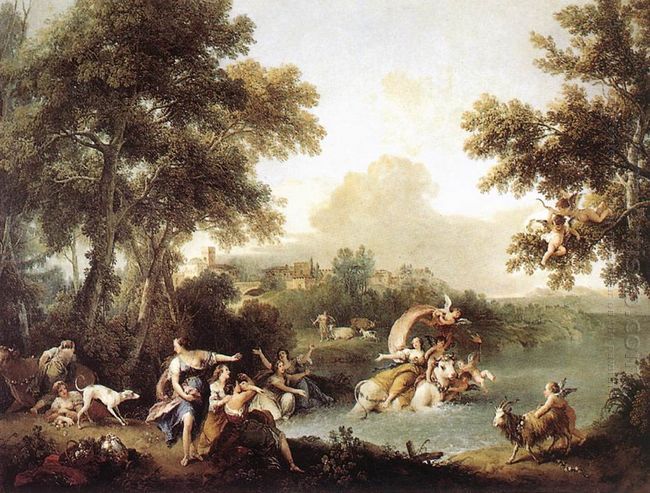
so that the screen showed the joyful and warm atmosphere. The painter deliberately depicted Europa’s excitement and nervous feeling and tried to depict the girl at the stunned excitement, with blue waves and mist confused the mountains, water and cloud to reach a colorful light, the charming effect.

The Venus of Urbino

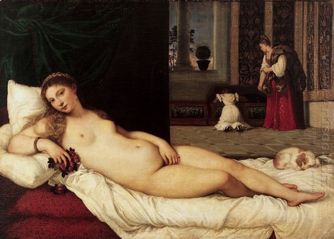
This work was commissioned by the Duke of Guidobaldo II della Rovere. It may be painted to celebrate his wedding in 1534. The Italian cassone with the original decoration which was a traditional box (also known as safe or Keith, was one of the oldest forms of furniture) was regarded as a wedding present. The maid behind the painting was carrying off to look for the clothes of Venus. Surprisingly, in view of its open pornography, the purpose of this painting was an enlightening model for the duke’s very young bride – Jurano.

The Venus of Urbino
The Venus of Urbino

The Venus of Urbino showed Titian’s delicate description and innovative composition. In front of painting, a naked beauty was lying in bed. The protagonist was believed to be a social butterfly with high income called Angela del Moro in Venice, which was also the mistress of Titian who accompanied him to have dinner. Behind her a large black cloth curtain covered the left half of the painting, and the right half showed the indoor scene and space. Titian cut off the background and dealt with the great difference to guide the viewers to know where was behind the shady place on the one hand. On the other hand, he intent to let people satisfy their inner desire. Titian’s processing and composition method was a challenge and breakthrough in the history of painting.

The painter placed Venus in a noble room, who seemed to have become the master of the bedroom. The Venus was staring at the audience and was indifferent to her naked body. Her right hand held a bouquet of roses, and her left hand covered her vulva, suggestively placing in the center. There was a small dog accompanying her beside the bed, and the dog was often used as a symbol of the “loyal”. The chamber had a maid who was prepared the clothes for the hostess after the bath. Titian placed Venus in an environment with strong family fun, which helped to strengthen the close and the warm feeling, and also catered to upper-class taste. In shaping the image of Venus, the painter gave full play to the body-building style, meant to depict the ideal and healthy women. Venus was rich, mature, gentle, and full of the young beauty. This painting became the leader in similar subjects, and also became the hard-to-reach typical type in female nude paintings.

Flora By Titian

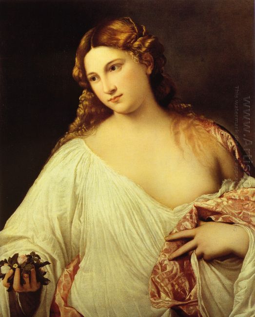
In the ancient Roman myth, flora was the symbolization of the wisdom, beauty, and love. From April 28th to May 3rd every year, the traditional flora festival was held in Italy. In these six days, people were experiencing all kinds of joyful activities and decorating themselves with roses or their beloved animals. In people’s mind, flora was a symbol of happiness.

Flora
Flora

Titian’s Flora targeted at the hypocrisy of asceticism in the Middle Ages, praised the beauty of female body, and repeated this eternal theme in the work again and again. In accordance with the aesthetic point of view of the Renaissance, Titian depicted the flora virgin. Like the early bud, her eyes flashed the reserved glory. But her body was as mature as that of a lady to meet the people’s general appreciation. Titian’s work was not as rigorous and quiet as Leonardo da Vinci in the composition and atmosphere, not as reserved and gentle as Raphael in the characters, not as painful and angered as Michelangelo. He was good at outlining the characters based on the brown background, rubbed out the hidden soft notes by hand, making the character float out with the color, like Botticelli’s Birth of Venus. Before this, no one dared to boldly depict the completely secular women who were full of vitality. If saying Michelangelo was the giant of using nudes who dignified to the church, then Titian was using the mature naked human bodies to express the confidence of the emerging bourgeoisie from the point of hedonism.


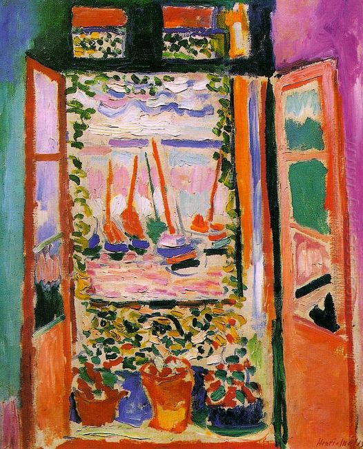
Open Window Collioure

Open Window Collioure was the work exhibited in autumn salon in 1905 when Matisse was 36 years old. In that salon, he showed the works of Open Window Collioure and Woman with a Hat. This painting was composed of wide vertical lines which were performed in bright green, blue, purple and orange. The window wall was only a small part, more like a gorgeous picture frame. But the window only accounted for the three fourths of the painting. The

casement was open. The balcony placed the flower pots and growing vine, then was the sea, the sky and the ships were showed with the brightest colors. In the distance there was a beautiful pattern with bright little strokes. The strokes extended from the green dots to a little wider light red, white and blue. In this painting, Matisse had exceeded any impressionist and showed the slight traces of abstract colors. Matisse said that this painting was inspired by the illness when he was 21 years old. What he painted was the window that he had stared at for a long time in the patient’s room.

Open Window Collioure

Open Window Collioure was perhaps the first example that the painting topic achieved the full development. For the rest of my life, Matisse always preferred this theme. It was only a small part of the wall and the windows accounted for a large space. The outside world was a beautifully decorated pattern with bright small strokes. Matisse said, “My painting is to express a state of mind.” The open window was showing a state of mind.


Woman With A Hat

Woman with a Hat was painted in 1905, which was the painting that made French Fauvism representative Henri Matisse famous. This work depicted a portrait of a woman’s back. Here Matisse aggressively abandoned the snap in the form and put the pigment indiscriminately on the screen. Not only the background and hat, but also the woman’s face and appearance, were in bold green and red brushwork to trace the outline.

Woman with a Hat
Woman with a Hat

In the autumn salon of 1905, Matisse exhibited a portrait of his wife, entitled

Woman with a Hat. This was the early Fauvism work of Matisse and also the most representative work of Fauvism, which caused a great sensation. In the painting, the strong colors directly out of the paint tubes did not represent the real objects existing in reality, but through the painter’s own visual experience of processing their characters to cause the vibration of the viewers’ retina, to establish a new painting criterion that was different from the tradition.

Woman with a Hat was the early work of Matisse. We could see that based on the realism, his attempts were made to an impulse. The various color paints that were applied to the woman’s face, clothes and hat were a bit stiff, but his determination was overweeningly ambitious. This was the innovation, which made an innovation to the realism and impression and created new forms. He gradually knew the bright colors could restore the passion of life, arouse people’s desire, and sublimate to the ideal realm filled with joy.

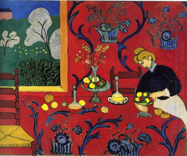
Oil Painting Harmony in Red

Harmony In Red
Harmony In Red

Harmony in Red was made in 1908, which measured 177 x 200 cm. It had a big width. Seen from the distance, it was totally red. Now it is preserved in Russia St Petersburg Al Mita Museum, which was one of the representative works of Matisse. In this painting, he made a new exploration and completely removed the perspective to show a pattern world full of contrasting colors with full colors, orange and blue, yellow and purple, red and black. The Islamic textiles, oriental tapestry or other decorations seen in Algeria, Spain and other places were plane.

Harmony in Red turned the scenes in front into decorative pattern and the perspective was completely removed. Through the window, the characters and scenery became part of the pattern. The dark lines ticked the simple shapes, and no walls, floor, table, with a large red, full of colors to show a full of contrasting color world. This painting was more exotic and mysterious than the image that Gauguin and other impressionists could imagine He only used one red block without harmonic production, defining the interior room space. Vine pattern was evenly distributed in the wall and on the desktop, which enhanced the red block’s attachment for the painting. The abstract trees and plants silhouetted against the green earth and the blue sky, defining the outdoor scenery. The red building on the top repeated the room’s color. To some extent, it established the illusion of depth of this landscape painting. Matisse abandoned the formal perspective and added a few strokes with perspective of embellishment, such as window frames, the chair in the left foreground, things placed in the table, vine pattern around the edge of the table. In essence, through the use of color and line, a fresh painting space world palpable was made.