Nude Maja by Francisco Goya

Maja meant the beautiful girls in Spanish. The model was said to be the Duchess of Alba. In this nude figures painting, Maja made her both palms crossed behind her head and her body reclined on the bed, seeming to be very plump. The artist meant to show the youth and beauty induced by Maja. As the female body with the modern description given practical meanings, it could be considered a pioneer. It was impelled to say that it was of great importance of anti-feudal in the dark rule of Spanish inquisition.

Francisco Goya painted the nude Maja in the open form, which made the body and spirit of Maja completely bare. Both of her hands were placed behind her head and her body slightly reclined. Her right leg slightly held the left leg, showing a little shyness. The whole body was lying in the green Turkey couch, which was full of flowing curve changes. The lifted breasts and prominent buttocks of Maja made the curve changes in body form rhythm, the soft pillow’s irregular morphology under the body and wrinkles formed the contrast with the pure physical changes. The painting Maja looked at this real world and implied the elusive inviting smile. This painting showed the beauty of human nature and human body. The feudal monarchy of Spain shadowed the feudal autocracy and darkness of the inquisition and all human art was destroyed, so Spanish paintings had very few body art as open as in the Italian works.

Goya described the nude Maja in the real life and boldly challenged to the asceticism. Nude Maja produced a peculiar kind of aesthetic effect: it was not only attractive, but also made people want to avoid, Maja was so beautiful that so many people longed for her. She boldly opened her breasts, which also made people daunting. Humanity’s sincerity and secular fear of contradiction made this painting full of mystery.
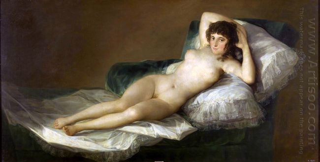
Nude Maja 1800
Nude Maja 1800

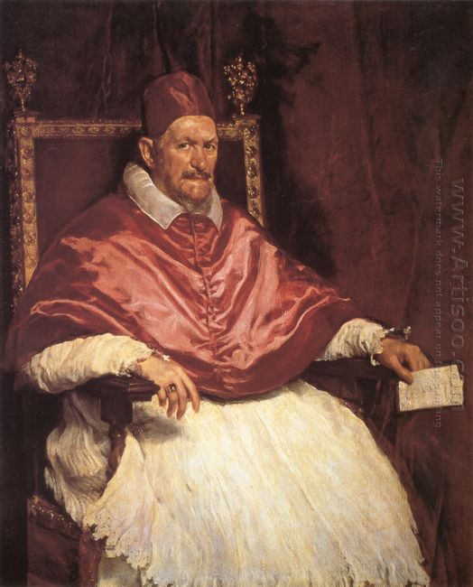
Portrait of Pope Innocent X by Diego Velazquez

Portrait of Pope Innocent X was perhaps Diego Velazquez outstanding portrait. The figure in the painting was the pope who ascended the throne in 1644. This pope seemed to never leave a good impression to people based on the people’s notes. Even he was considered to be the ugliest man throughout the whole Rome. Reportedly, his face was not symmetric and the forehead was bare, who looked somewhat deformed. And his temper was irritable. However, such an ugly and gloomy man became a perfect descriptive theme under the Velazquez’s brush.

In 1650, Velazquez once again came to Italy and left this piece of precious portrait to the pope. The whole painting adopted the pure tone, like a red variation. The red skin, blood red lips, shawl gleaming the gloss, the little red hat on the head, the red velvet on the seat’s back and dark red background created a singular effect, making people feel his saliva was also red if the bishop opened his mouth. He directly pointed to our eyes with the tight brow and each reader was able to boldly guess his character: sensitive, cunning, insidious, sinister. In fact, when the portrait was finished, the pope seemed somewhat embarrassed and accepted this work. Although he did so, he did not show it. In the face of this famous artwork, he only made a remark, “It is so real.”


Portrait Of Pope Innocent X 1650


The whole painting took the red as the background and showed a sense of dignity to bring out the pope’s serious majesty. The pope’s face showed an instant strong expression and portrayed the cruel and cunning inner world; but from the Pope’s weak and feeble hands in the chair, it was not difficult to find out his spiritual weakness, which enriched the Pope’s image and left the unlimited reverie for the future generations. His red cape on the pope and white vestments formed a strong color contrast and rendered the painting’s solemn and dignified atmosphere. This painting showed the painter’s superb painting skills, which had the high artistic value.

To The Parnassus by Paul Klee

To The Parnassus was Paul Klee masterpiece, which deeply expressed the painter’s great desire to reach the artistic peak. The subject of this painting contained two tiers of meanings. The first layer of meaning is: based on the myths and legends, Parnassus was the holy mountain in charge of art and music God Apollo and Muse. This work clearly expressed the painter’s wish to enter the temple of art. the the color of light. What these colors expressed was Klee’s inner feeling and his thought and insight for the life. The whole Expressionism painting not only had the rich contrast between the top and the bottom, but also owned the gradual upgrade from the lower left to the upper right. With this contrast and gradual change, Paul Klee created the indeterminate light and whirling visual effect and appropriately showed his slightly confused mood when he was in the pursuit of career. This painting also showed Paul Klee’s view of life: climbing the peak needed the constant accumulation, and consistently enriched its spiritual world.

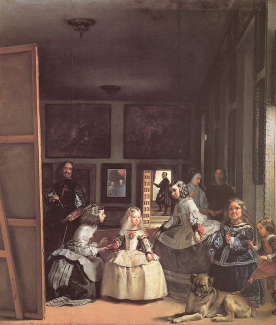
Artistic Appreciation of Las Meninas Detail of the Lower Half Depicting the Family of Phi

The central of this figure painting was the little daughter of the Spanish king Philip IV Princess Margaret. She was in the center of the painting and exuded the graceful manner. A maid on the left knelt down and offered some refreshments for her. But the princess disregarded her and seemed quite willful. A maid on the right was bowing down to pray her to have dinner or do others? On the lower right corner of this Velasquez painting, there were two dwarfs for fun of the court and a sleeping dog. Two eldest servants standing behind the princess may be the regulators of the daily life in court. They seemed to be talking about something and had been interrupted.

The most interesting thing was that Velasquez placed himself in the painting. He held the palette and stood on the huge canvas board. Actually he was drawing a portrait for himself. Velasquez deliberately highlighted the knighthood he wore to show his nobleness, which was his dream. The soldier stood in the portal of exit and did not straighten his body. One of his feet was on a lower level. And at this time, people in the whole painting looked to the front. What what attracted their attention?

The figures reflected through the mirror on the wall were the king Philip IV and queen Margaret, as we knew. They attracted all eyes. But, was it Velazquez that drew the portrait for the king couple portrait? Is the sudden coming of the princess Margaret that brought trouble for the painter or the immediate show making the whole story with a dramatic change when Velazquez made the painting for the little princess because of the princess’s caprice? Besides the honorable Margaret princess, each figure showed an air of panic and only the artist was so calm. But at this time, the light coming through the side window framed the painting in this moment. This moment was like the shutter of the camera that quickly grasped the scene, which was so real and unknown.

Las Meninas Detail Of The Lower Half Depicting The Family Of Phi


This work with 3 meters in height

had the same size of each object and the real figure, which showed Velazquez’s superb techniques. The artist portrayed every object perfectly. Treatment of texture, shape, space, light and shade made people overwhelmed with admiration. What the painter showed to people was a “real” statue of time fragment.

How to Appreciate Paintings?

Western painting includes oiling painting, block, copperplate, watercolor, and poster color, etc, among which oiling painting is the most expressive, practical and decorative painting. For the subject, oiling painting can be mainly divided into theme painting, genre painting, landscape painting, portrait and still life. But whatever the subject is, works mainly rely on shape and color these two main elements. In other words, the ways of expression of paintings are shape, light and color.

Shape, or we can say, form and structure. This requires that the artist must have the ability to shape first, and he must have a strong foundation sketch. If the artist is not good at charcoal drawing, it would be difficult for him to draw a good oil painting. Light is the effect of light. After the rise of French Impressionism, people triggered the research and manifestation for light, and painter tended to have a scientific and rational understanding of it.

The most important element in the painting is the color, which is different from the color in color palette. Painters never put the colors on the palette that the factory produced to canvas without mixing. These colors need to be mixed
the pass line. In addition to the above requirements, the appreciation of oil paintings should also focus on composition, strokes, rhythm, etc.

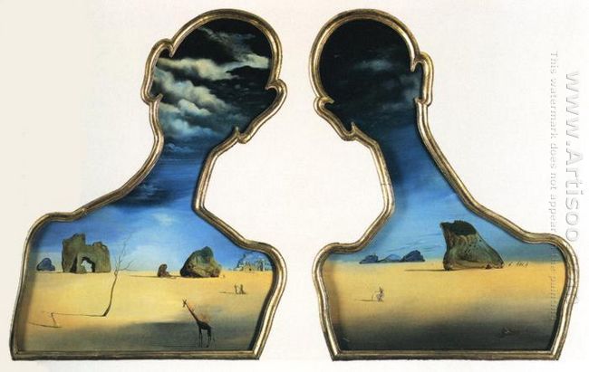
A Couple With Their Heads Full Of Clouds

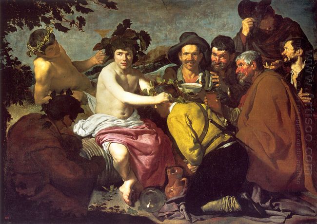
Triumph of Bacchus by

The earliest Triumph of Bacchus during Renaissance was the statue made by Italian Michelangelo in 1496. The Spanish

Triumph Of Bacchus was based on the Roman mythology. Bacchus was Dionysus in Greek mythology. According to the legend, he pioneered the use of grape wine, and spread the methods of the grape growing and honey gathering to the whole world. But Velazquez used the Spanish peasant image and its way of life to represent this scene. These figures wore the hat and the thick coat and were drinking in high spirit. They were saluting to the young bacchus. The bacchus was half naked and wearing a hat with wings and giving a person back to the audience with flowers. His eyes were squinting out of this Baroque painting. There was only the optimistic life and farmer’s enthusiastic character. There was no the bacchus in the legend. All of this was just a life scene that the Spanish farmers drank during rest. Appreciation of this painting made people reminiscent of the humorous philosophical spirit described in Cervantes in his “Autobiography of Don Quixote”.

Triumph of Bacchus 1628

How to Protect the Oil Paintings?

If one oil painting gets well protection, it would keep its color for years, if not, the chromatograph may break, fall off, or change color. So, how to protect your painting and avoid damage? Here are the experiences from a

gallery owner, we can learn something from him:

1. get some natural beeswax which dissolved in turpentine, then coat twice in the back of canvas thinly, it would absolutely prevent the wet air.

2. Avoid long direct sunlight, ultraviolet has huge destructive effect to the color, it would cost color fading and changing color.

3. The room which store oil painting should be ventilated and dry, be away from bathroom and kitchen as much as possible. Avoid the dust, lampblack and mildew to cause damage. Keep a certain temperature and humidity in room. Once the painting become damp, it must dry in the shade, must guard against the blazing for a long time, otherwise the painting would easily fall off.

4. Never stick one painting to another painting, the painting may paste in each other when the temperature is high then cost falling off and damage.

5. While rolling the oil painting, use more than 4 or 5 inched paper tube, canvas inside and painting outside, then wrap it with a plastic cloth to avoid crack..

6. If there is dust in the painting on the wall, use sight-damp clean cloth to wipe it. If there is lampblack, use diluted soap-suds and fresh water to scrub it then immediately bring some thing to absorb the water, then use a fan to blow the water. For the longstanding and cracked oil painting, use less water, part wiping is enough. Some people buy gross oil to maintain the oil painting, it’s available, but the painting must get clean before the spraying.

7. Generally, oil canvas could preserve for two to three years. As the time goes by, some painting may start to crack. So, pack up the paintings which not on the wall with cloth if you have many collections. Put then to a wood box.

There are for reference only, more skills still need the collector to ponder in practice, constantly sum up and enjoy from the process.

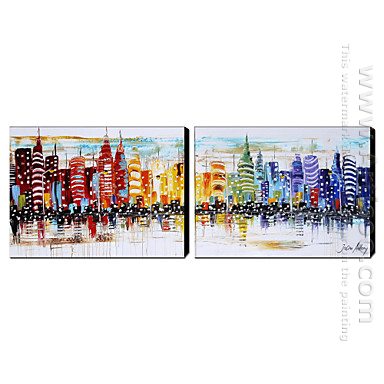
Hand Painted Oil Painting Architecture Wide - Set of 2
Hand Painted Oil Painting Architecture Wide – Set of 2

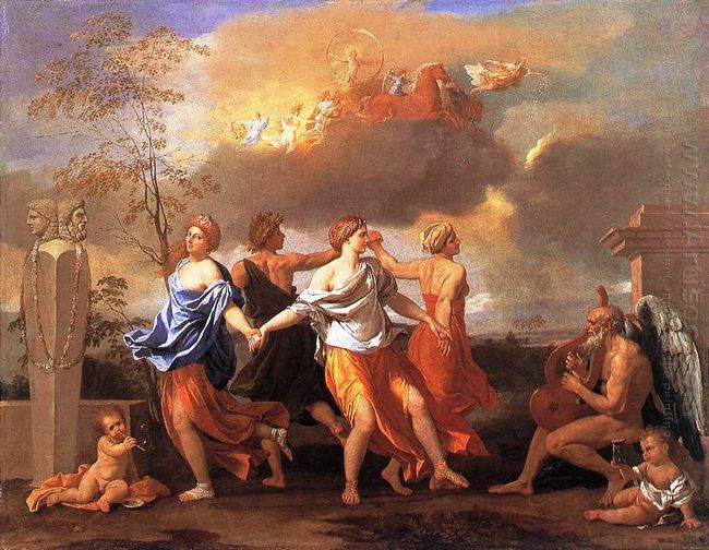
Dance to the Music of Time by Nicolas Poussin

Dance to the Music of Time was made when Nicholas Poussin was commissioned by Pope IX Clement. He was the philosopher and playwright, who was also the typical admirer and collector of Poussin’s works. This Nicolas Poussin painting was made in 1638, measuring 82.5X104cm, which is collected in the London Wallace Museum.

This genre painting brought a sense of information or confusion, which was a general discussion about the time, fate and human survival. What it appealed to the viewers was the ration rather than emotion. The composition of symbolic implication of Poussin in performance and geometry coordination made the conception in the specific form. The round dance represented the reciprocating life cycle and each dancer had its implicated effect. The dancers in the painting were the four allegorical figures: wealth, happiness, diligence and poverty. In this classicism painting, various elements that showed the changing time were around the dancers. Everyone’s expression in the painting looked concentrated and enjoyed dancing, which was admired by people with its shown beauty and harmony. The work invited us to discuss the meaning that the four figures represented as well as the significance between them and other symbols of the background.

In the distant dawn, the sun god Apollo was going ahead with the carriage under the guidance of goddess of dawn. The middle of the painting was a four-member waltz. They represented the wheel of fortune which was composed of four stages. People would spend the rest of their life through this cycle, again and again. The painting was full of eternal and short contradictory images. The old “Father Time” played the harp for the dancers. Besides him, the naked children held an hourglass; the time flied with the stream of time. This was a masterpiece with the precise composition and accurate skills. All of Poussin’s works implied a complex but perfectly reasonable and carefully designed geometry. One of the funs was to appreciate the potential geometric structure in his work. In this painting, the dancers’ circular motion was placed in a triangle.

Dance To The Music Of Time 1634

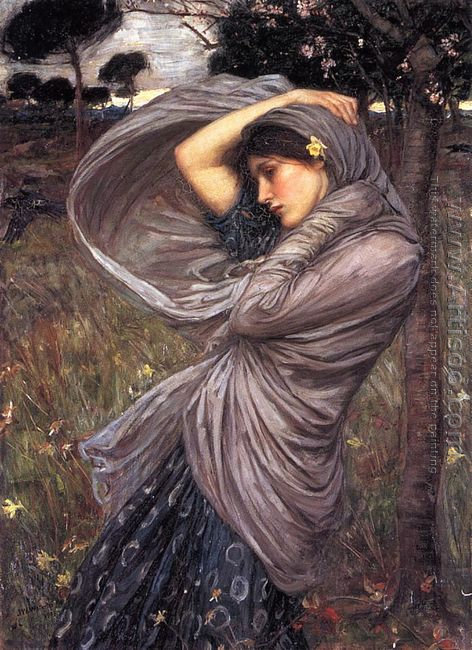
Boreas 1903 by John William Waterhouse

Boreas was created by John William Waterhouse who enjoyed great prestige around the world for his Pre-Raphaelite style. His several decades’ dedication to Pre-Raphaelite after its breakup earned him a moniker of “the modern Pre-Raphaelite”. Waterhouse

importance to detail in the background of his paintings as he did his foreground, he used muted colors so as not to distract from the main scene and yet they also reflect the feel and mood of the piece. The exquisite lines and elegant structures of the waving clothes Waterhouse painted shows the romanticism he wanted to express.

Boreas 1903
Boreas 1903